Bringing Brand Consistency to P&O Cruises Website Redesign
Role
UI Designer & Brand Advocate (Representing the Marketing Team)
Duration
2 months
Tools
Figma, Adobe Creative Suite, CSS, Collaboration Tools (e.g., Miro, Slack)
Teams Involved
Marketing Team: Safeguarding brand consistency and tone of voice.
Digital Team: Spearheading the website rehaul for improved functionality and modernisation.
External Agencies: Collaborating on rebranding and design implementation.

From “Like No Place on Earth” to “Brings Us All Together” — the P&O Cruises brand evolution.
Problem Overview
P&O Cruises’ website was outdated and misaligned with both the old and refreshed brand identities, calling for a strategic overhaul and close coordination with internal teams & external agencies.
Solution
Coordinated with marketing, digital teams, and agencies to translate the 2023 rebrand into a cohesive site through strong stakeholder management and iterative feedback.
My Role
As part of the design team under P&O’s Marketing division at Carnival Corporation, I represented the marketing team in the P&O Cruises website rehaul project. The digital team, responsible for the website, had already embarked on the rehaul to improve user experience and increase conversions.
However, the marketing team had been excluded from the process, leading to a significant gap in branding consistency. My role was to bridge this gap, ensuring that the website aligned with P&O’s long-standing brand identity while collaborating with the digital team to maintain functionality and business goals.
Deliverables
Presented detailed implementation decks during initial phases, followed by a comprehensive Figma handover for the final rehaul—though full rollout was paused due to P&O’s merger with Carnival Cruise Lines.
Problem 1.1
A Vibrant Brand Trapped in an Outdated Frame
P&O Cruises' brand embodied a spirited, uniquely Australian escape with a fun and friendly brand personality. The tone of voice was smart and playful, filled with casual, lighthearted language. The visual identity was vibrant and full of life, leveraging bold typography, oceanic themes, and bright colors to evoke adventure and camaraderie.
But the website didn't really fit in to the latest website trends.
- Cluttered Layout and Visual Noise: The page was packed with competing elements, lacking a clear visual hierarchy and overwhelming users with information.
- Outdated UI Style: The design felt reminiscent of early 2010s web patterns, with flat buttons, small thumbnails, and no modern visual depth.
- Uninspiring Cruise Presentation: Cruise options were displayed like static catalog listings, missing travel's emotional appeal and excitement.
- Urgent Need for Modern Revamp: A fresh approach would better reflect the joy and adventure of cruising, while aligning with current UX best practices.

Old brand website interface snapshot—rich in information, light on user focus.


Old brand kit: sale-driven posters, playful headline fonts, and a punchy tropical palette.
Soltuion 1.1 & Problem 1.2
Progress with a Price: A Brand Identity Mismatch
The first intervention—led by the digital team and an external agency—modernized the site and improved usability and aesthetics. However, it diverged notably from the established brand identity, leading to several key issues:
- Excessive Use of Darkness: The website design leaned heavily on dark themes, creating a grim and somber feel—opposite to P&O’s bright and lively persona.
- Overuse of Wildberry Color: The red-like hue was excessively used, making the UI resemble an error state.
- Heavy Gradient Overlays: Cruise imagery was overly covered by dark overlays, dulling the vibrant and inviting feel.
- Stakeholder Resistance: Gaining buy-in from the digital team to implement brand-aligned changes required careful negotiation.

Agency draft: cool blues and muted tones—restrained hues that clash with P&O’s lively spirit.

Stormy gradients and heavy overlays overshadow the playful cruise energy.
Solution 1.2 - My intervention
Refining the Visual Theme: From Dark to Oceanic Blues
To bring the design closer to the 2010 P&O brand book, I worked alongside the digital team to implement the following key fixes:
- Replacing Dark Themes: We swapped out excessive black and dark blue overlays for lighter blues that resonated with the brand’s oceanic theme.
- Refining the Color Palette: Reduced the overwhelming use of Wildberry, opting for Lava orange, which maintained a vibrant but non-error-inducing appearance.
- Restoring Image Vibrancy: We reduced the gradient overlays and increased transparency to make images more lively and engaging.
- Stakeholder Management: Through strategic discussions, we secured a 50% implementation of these changes—a win for marketing despite resistance.


Six tweaks: 1 ) Lava replaces Wildberry, 2 ) 80 % Black-is-Black cut to 30 % Midnight Swim, 3 ) full tints → bottom fades, 4 ) gradients unified in one direction, 5 ) 70/30 rule applied to grid cards, 6 ) same gradient on the “We Are the Destination” hero—bringing back P&O brightness.
Problem 2.0
Unexpected Rebrand & Rapid UI Transition
Shortly after implementing these fixes, a new P&O rebrand was set to launch in two months, unknown to the digital team. Since the external agency’s contract had ended, we had limited time and resources to adjust the website to match the 2023 rebrand.


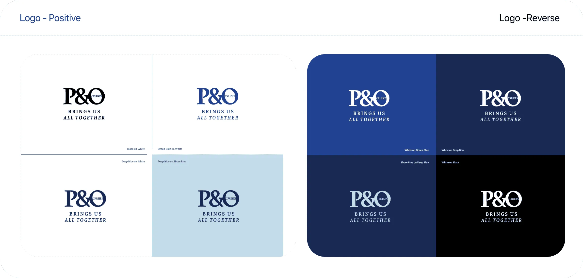
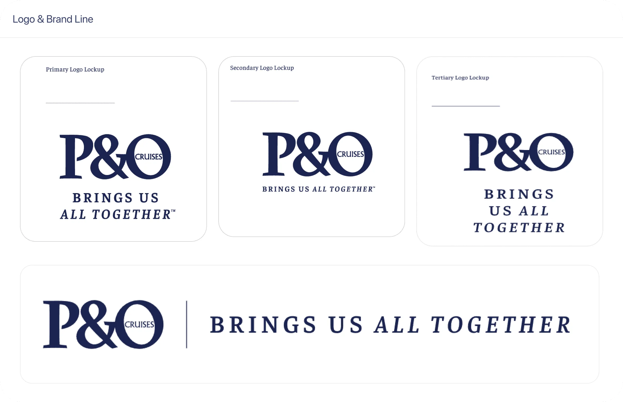
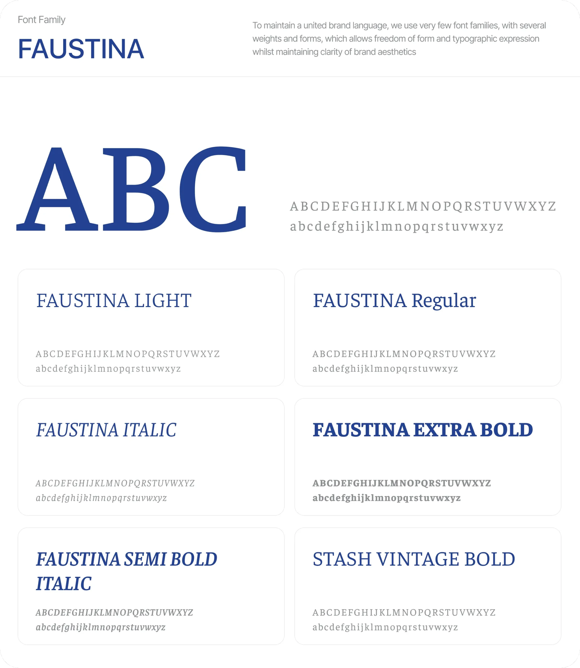
New brand direction: signature ampersand graphics + “Brings Us All Together” lock-up on lifestyle shots, flexible logo colourways, and the Faustina serif set—clean, people-first, unmistakably P&O.
Temporary Solution 2.0 - My intervention
Quick-Fire UI Improvements for Immediate Impact
With only two days to deliver, I quickly:
- Provided CSS change cards for all H1s, H2s, and color schemes.
- Audited different elements and suggested quick-win changes to improve legibility.
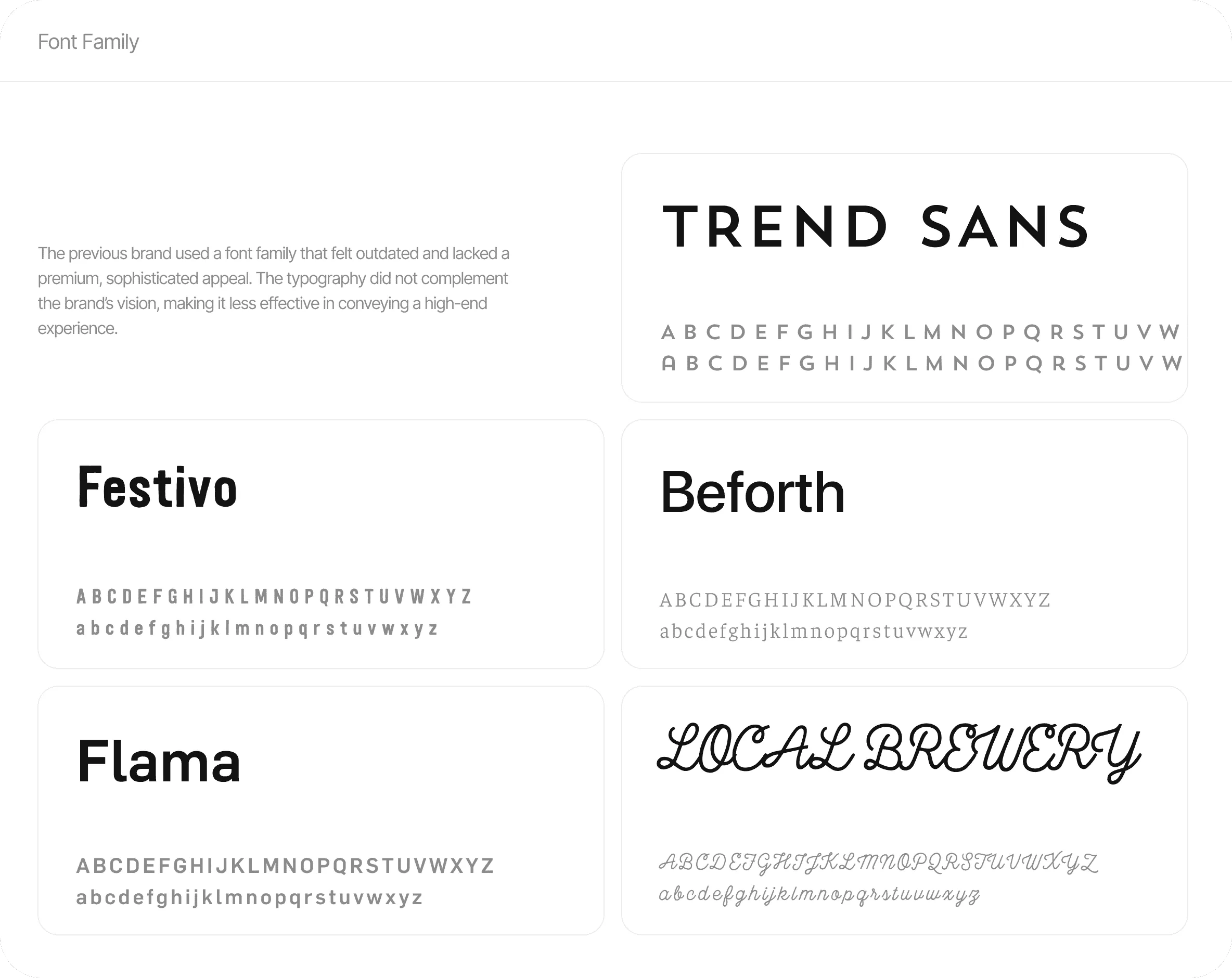
- Adjusted the font choice, moving from Faustina (print primary font) to Gelasio, a more web-compatible serif.
- Improved font hierarchy and visual hierarchy, ensuring readability while maintaining a visually appealing UI.
- Recommended reducing banner size, which had previously obscured key imagery.


Two-day triage: swapped body copy to Gelasio, reinstated Faustina weights for headlines, realigned fare cards & capsules, and stripped noisy backgrounds—rescuing the site from its mixed-font mash-up.
Long term solution 2.0
Refreshing the Look, Improving the Feel: P&O Website’s Full Rebranding Overhaul
To fully align with P&O’s refreshed visual identity, we collaborated with a third agency for a comprehensive rehaul of the website in Figma. Our focus was on refining both the branding and user interface to ensure a seamless experience across all touchpoints. Key updates included:
Typography & Brand Identity: We transitioned from the previous font to Faustina for a more print-appropriate look, while incorporating Gelasio, a web-friendly serif, for improved readability online
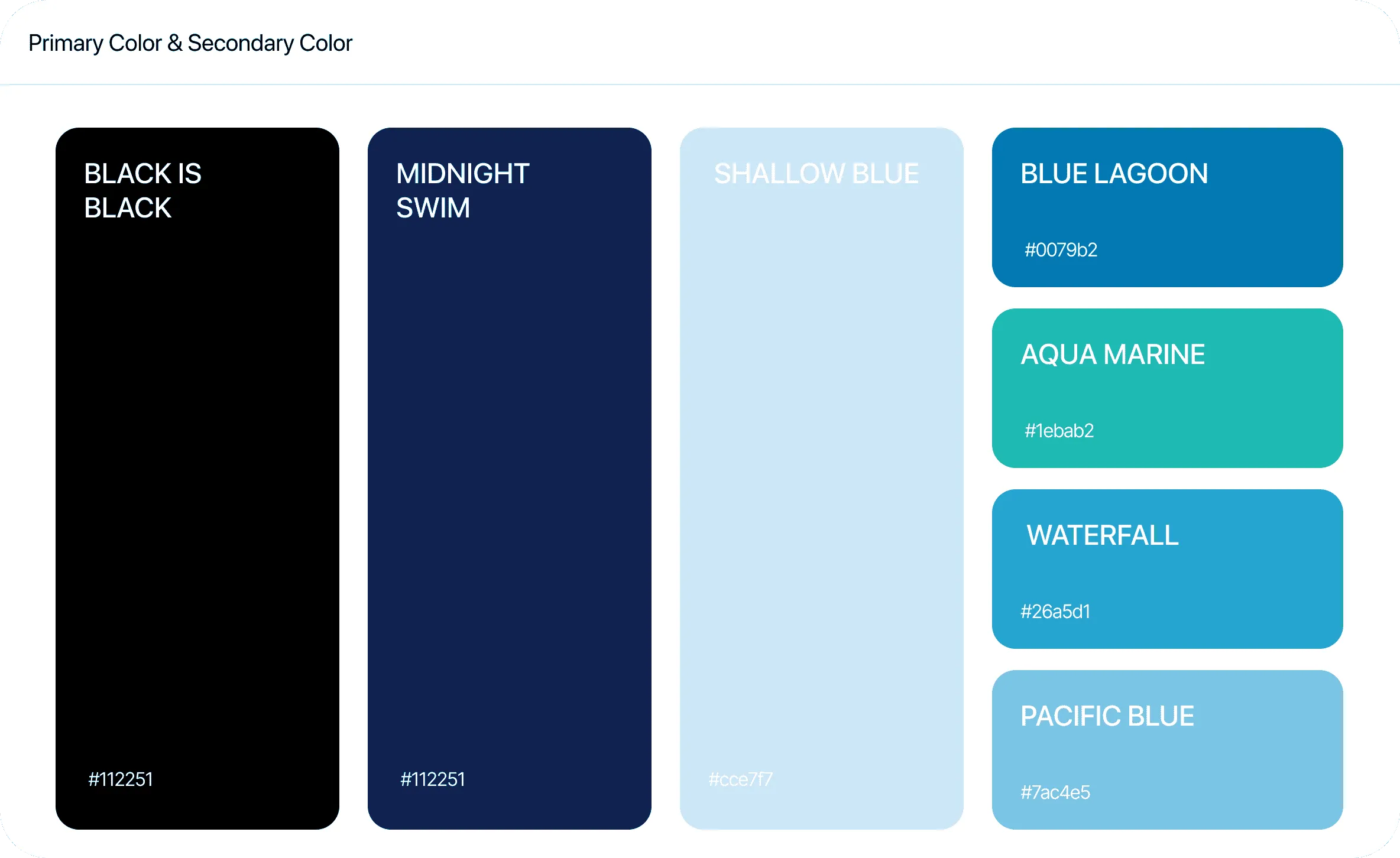
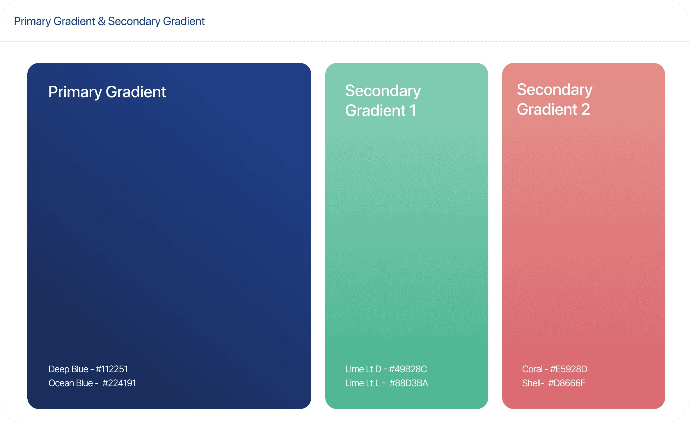
Color Palette Redesign: The new color scheme shifted to more subtle tones, replacing the earlier bold hues with a refined palette that resonated better with P&O's oceanic theme, creating a more sophisticated and inviting feel.
User Interface Enhancements: We simplified the interface by reducing visual clutter, ensuring a cleaner layout that highlights key content. Text and imagery were better balanced to improve readability, while the overall design felt smoother and more cohesive.
Cruise Card Redesign: As part of the broader update, we reworked the cruise card designs to be more intuitive and visually appealing, removing unnecessary gradients and focusing on clarity and depth for a more engaging user experience.

Four card variations—(1) full-bleed photo with slim info bar, (2) image-top/details-bottom split, (3) white-framed inset for a minimal look, and (4) bold overlay with navy price panel—testing different balances of imagery, hierarchy, and contrast.

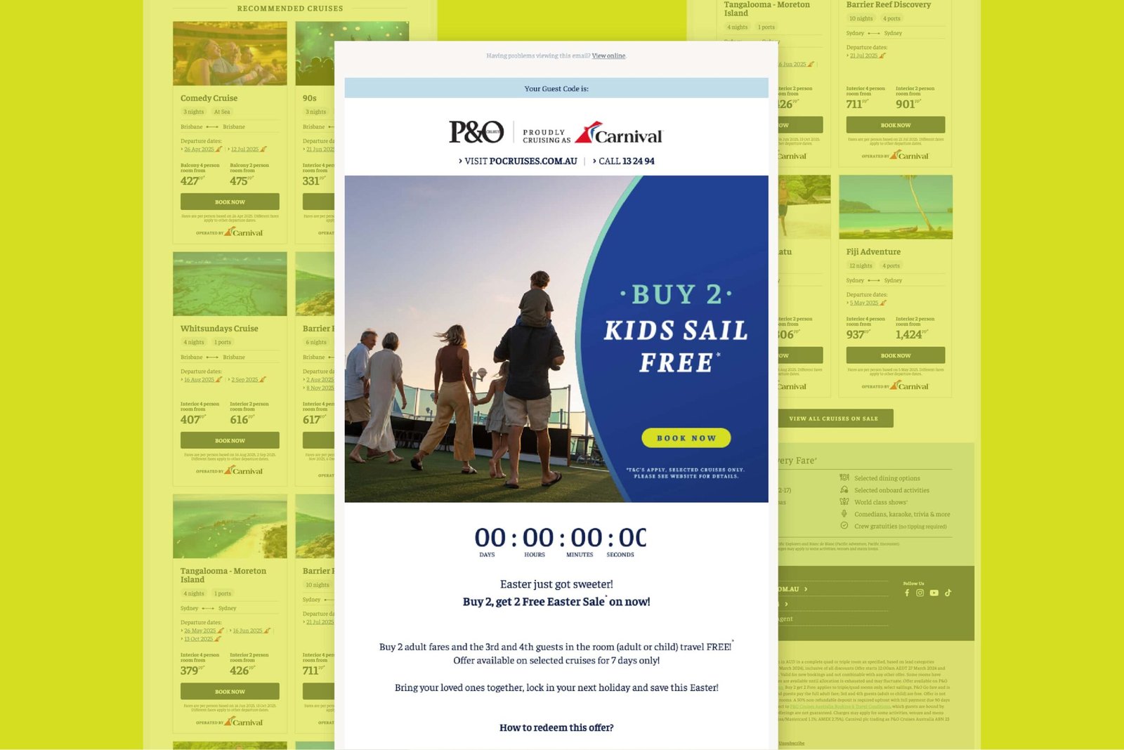
New identity in action: immersive banner, script sub-line, tidy search bar, and refreshed card set in deep-blue and teal accents.

Branded booking journey: login, hero, guest form, and room-type step all dressed in the new navy + Faustina combo for a seamless look.

Responsive pay-page: room recap, FCC options, secure card form, and bold “Book & pay” CTA in the new P&O style.
Project Conclusion & Outcome
Despite efforts to refine and implement the new UI, P&O’s acquisition by Carnival Cruise Lines resulted in the abrupt halt of all growth projects, including this website rehaul.
However, key takeaways include:
- Successful Advocacy for Brand Consistency: Marketing’s voice was integrated into the website design process.
- Strategic Problem-Solving: Overcoming resistance and working within tight constraints led to a more refined digital experience.
- Cross-Team Collaboration: Bridging marketing and digital teams ensured better alignment for future projects.
Although the project did not reach full completion, the work done significantly improved brand consistency, user experience, and stakeholder engagement for P&O Cruises' online presence.
Other projects