! This project is a part of a series ! UX Revamp has been undertaken for the following pages:
01 Homepage | 02 Blog & Cruise Destinations (You're viewing this currently) | 03 Cruise Deals
CCL Australia's Blog & Cruise Destination
UX Re-evaluation & Re-design
Role
UX Designer working with CCL's Marketing team
Duration
3 months
Tools
Figma, Adobe Creative Suite, Collaboration Tools (e.g., Miro, Asana)
Teams Involved
CCL Marketing Team: Primary stakeholders who own the marketing strategies and the website
P&O's UX Designer - AdHoc: Collaborating on the Website UX improvement of high traffic areas
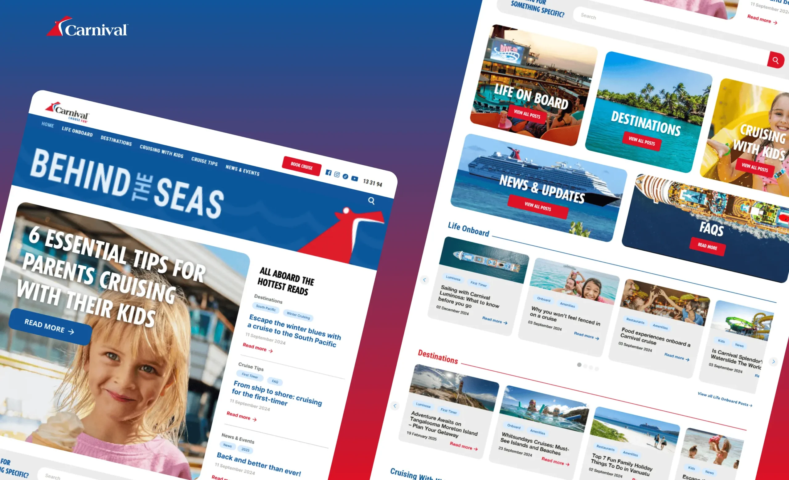
Redesigned Carnival Australia’s blog to elevate discovery, boost relevance, and support dynamic content growth.
Problem Overview
CCL's 'Behind the Seas' blog suffers from inconsistent branding, confusing navigation with no clear path back to the main website. It also lacks conversion elements resulting in missed opportunities to engage readers and drive bookings.
Solution
Various changes were proposed to align the blog with CCL’s main site including swapping in full‐width imagery, improved navigation, clearly styled internal links, and a new tagging system. Conversion elements were introduced to drive engagement and bookings directly from blog traffic.
My Role
As the UX Designer, I led stakeholder workshops to align on blog and cruise‐destination goals, conducted competitive research on top cruise blogs, and crafted Figma mockups for the site and article enhancements—updating imagery, typography, cruise cards, and FAQ modules. Working closely with the marketing team, I helped explain the CSS changes required for consistent fonts, embedding Optimizely banners via shortcodes, and researched methods to integrate cruise cards into the WordPress templates. Finally, I guided QA efforts by setting A/B test hypotheses and Hotjar tracking parameters to measure performance post‐launch.
Deliverables
A comprehensive documentation PDF that included a UX research summary with pain points and competitive audit findings; Figma prototypes and before/after screenshots for both desktop and mobile, covering the blog homepage (imagery, typography, search bar, banners) and the Cruise Destinations page (author byline, cruise cards, shore-excursion highlights); a detailed implementation plan outlining CSS updates, plugin configurations, and Optimizely integrations; a prioritized timeline and roadmap (Q2 2025 priorities through Q1 2026 phases); and a testing and monitoring framework complete with A/B test plans for search-bar UX, navigation CTA wording, banner CTRs, cruise-card click rates, and Hotjar heatmap tracking.
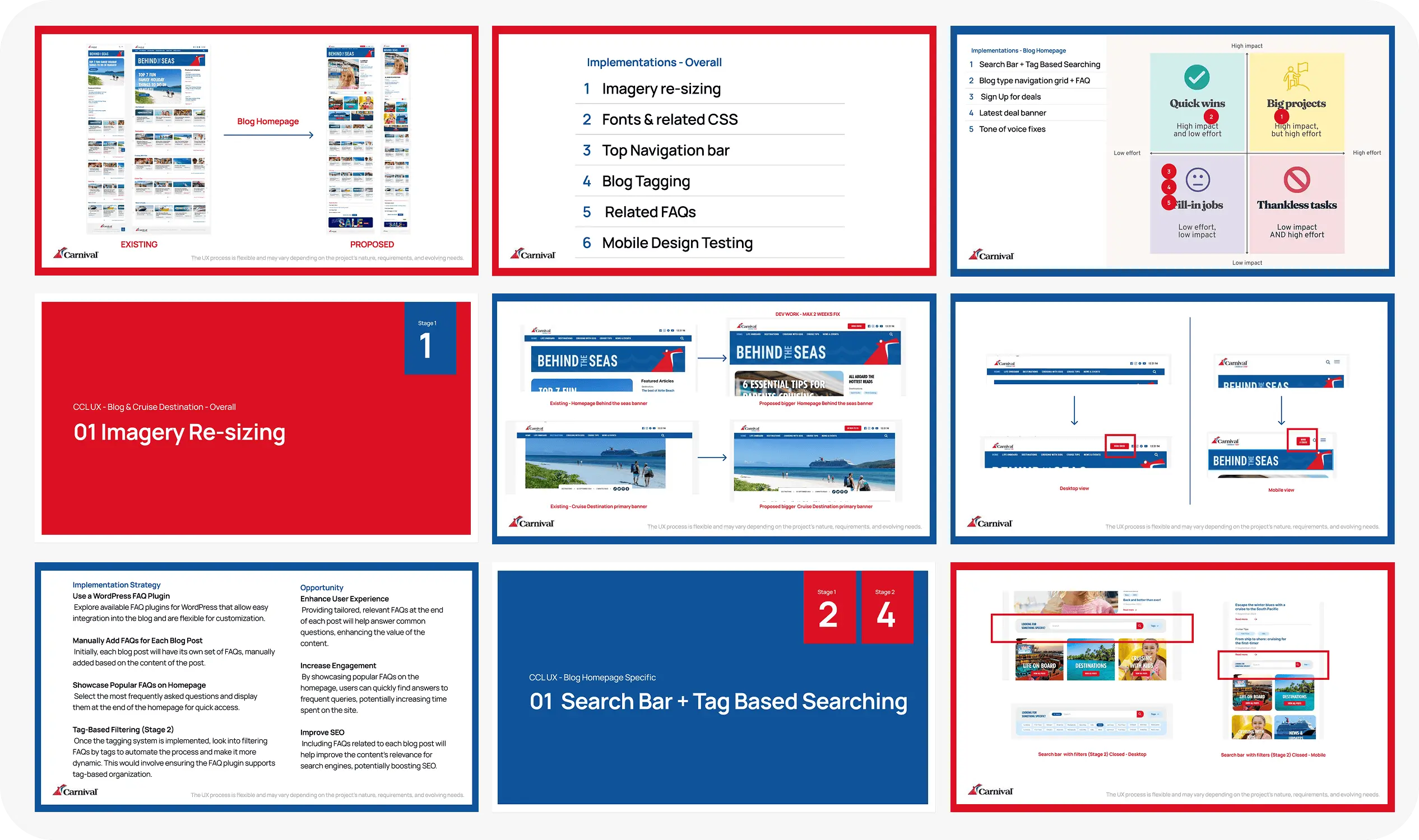
Documentation of refreshed blog layouts, experimental modules, and a detailed A/B testing plan to guide optimisation and measure impact.
Challenges & Opportunities
Several key issues on the “Behind the Seas” blog and Cruise Destinations page were identified that hindered user engagement, brand cohesion, and conversion opportunities. These challenges stemmed from inconsistent design, unclear navigation, and missing functionality that prevented readers from easily finding relevant content or converting into cruise bookings.
Inconsistent Branding & Typography: Mixed font usage (e.g., Helvetica for body text, sporadic Tempo headings) and undersized, low-resolution images created a disjointed experience that diverged from CCL’s main site.
Poor Cross-Site Navigation: Absence of a clear “Return to CCL” pathway left users stranded on the blog with no intuitive link back to booking or related deals.
Limited Content Discoverability: Broad categories (“Destinations,” “Cruise Tips”) and a difficult-to-scan layout made it hard to locate specific posts (e.g., “South Pacific,” “Mediterranean”), reducing time on site.
Missing Conversion Elements: Lack of “Sign Up for Deals” or “Latest Deal” banners, embedded cruise cards, and in-situ FAQs meant readers were not prompted to engage further or book directly from blog content .
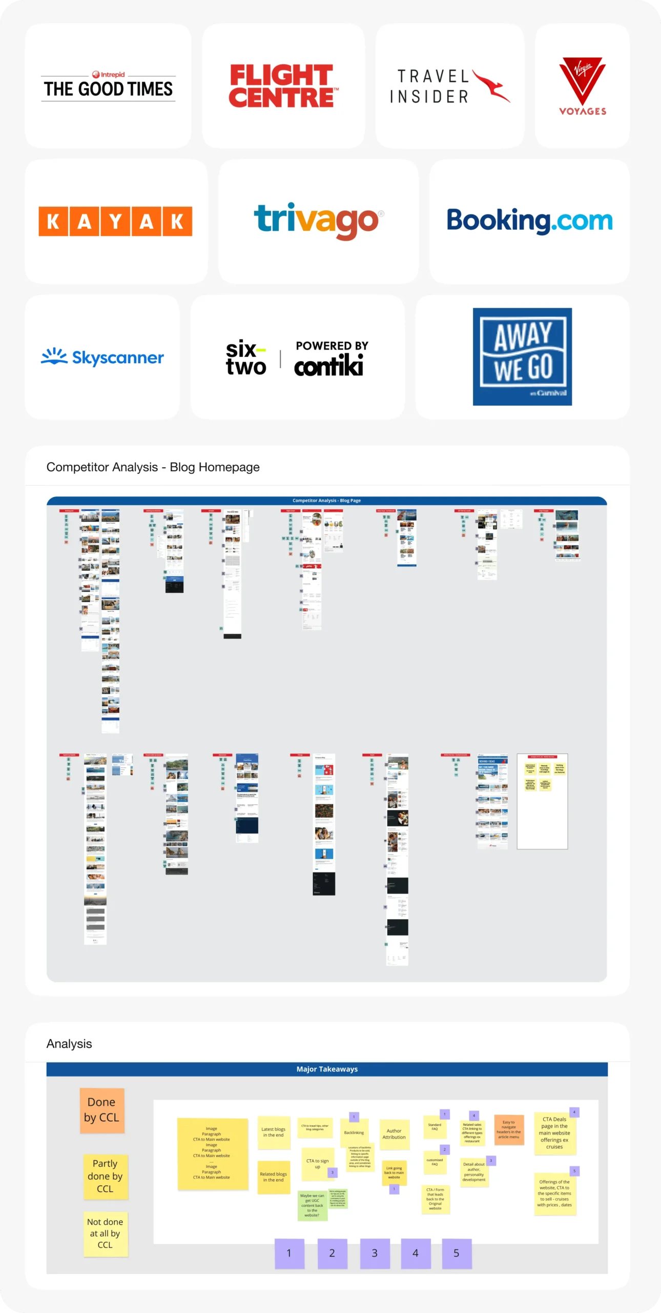
Benchmarked travel blog experiences and mapped key takeaways to identify gaps, prioritise improvements, and guide Carnival’s blog redesign strategy.
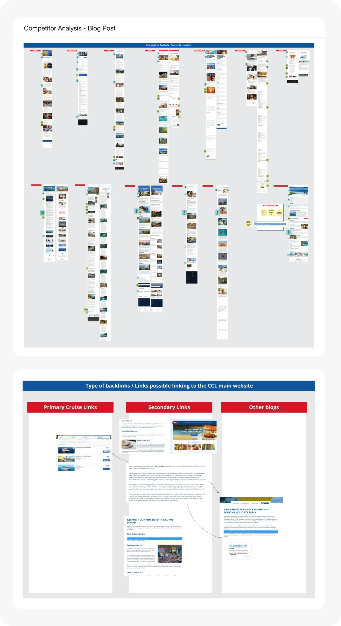
Analysed how top travel blogs structure destination content and link back to parent sites—informing SEO and cross-site journey strategy for CCL.
Competitor Analysis
To inform the redesign of CCL Australia’s “Behind the Seas” blog and Cruise Destinations page, a detailed audit was conducted on leading cruise‐brand blogs and travel sites. Key findings included:
- Visual & Typographic Standards: Most competitor blogs employed consistent, brand‐aligned fonts and large, full‐width imagery. This created a polished aesthetic and reinforced trust—an approach lacking in CCL’s existing blog design.
- Navigation & Cross‐Site Links: Top travel blogs featured persistent header navbars with clear paths back to main booking pages or related services. Competitors often included “Book Now” or “See Deals” buttons visible at all scroll depths, whereas CCL’s blog lacked such anchors.
- Content Taxonomy & Discoverability: Best‐in‐class blogs used granular tagging systems—allowing filtering by region, cruise length, or theme—and displayed tag clouds or category grids prominently. This supported better content discovery.
- Embedded Conversion Elements: Competitor sites frequently embedded dynamic banners (“Sign Up for Insider Deals,” “Latest Offers”) and contextual callouts (“Top Mediterranean Cruises,” “Shore Excursions Spotlight”) directly within articles.
- Integrated Cruise Cards & Pricing: Several cruise brands utilised in‐article “cruise card” components with real‐time pricing, images, and “Book Now” CTAs. These cards matched their main site’s styling and offered smooth API‐driven updates. CCL’s Cruise Destinations page lacked any cruise integration, representing a missed opportunity.
These insights directly guided our decision to: standardize typography and imagery, add a persistent “Book a Cruise” link, implement a robust tagging system, embed Optimizely‐driven banners for conversions, and integrate cruise cards within destination articles—aligning the blog experience with leading industry benchmarks.
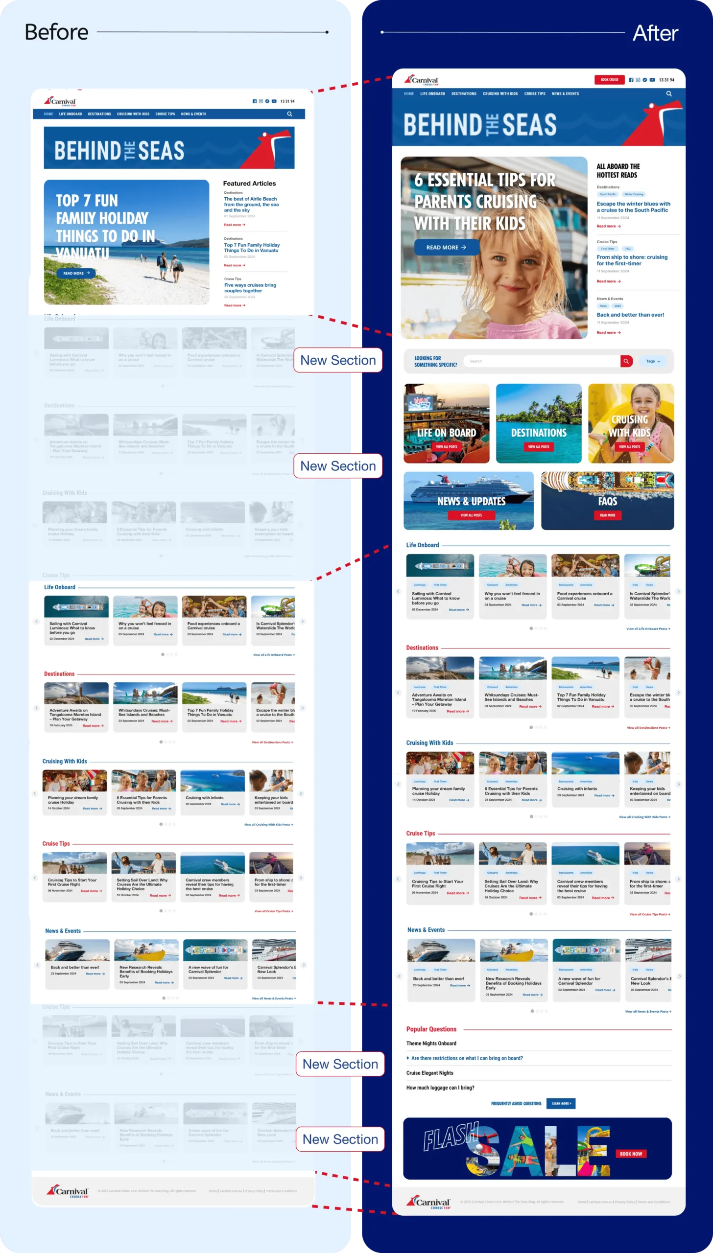
Redesigned the desktop blog homepage with a cleaner layout, new sections, and improved content discoverability.
Approach & Solution
The approach combined strategic research, stakeholder alignment, and modular design to address UX gaps while leveraging existing WordPress and Optimizely frameworks.
Beginning with an audit of technical constraints and competitor best practices, the design principles focused on brand consistency, improved content scannability, seamless cross-site navigation, and built-in conversion prompts. These guiding principles informed both the blog homepage and Cruise Destinations page enhancements, ensuring each solution integrated smoothly with CCL’s main site while driving engagement and bookings.
A. Higher-Level Strategy
Audit & Discovery
- Conducted stakeholder workshops to gather business goals, audience insights, and technical constraints (WordPress vs. Sitecore).
- Performed secondary research on leading cruise-blog architectures (e.g., Royal Caribbean’s blog, Disney Cruise Line’s newsroom) to identify best practices around tagging, cruise card integration, and FAQ placement.
Design Principles
- Visual & Brand Consistency: Align typography, color palette, and imagery with the CCL main site.
- Scannable Content: Introduce modular sections (search bar, tag grid, FAQs) to break up long text.
- Seamless Cross-Site Flow: Embed clear “Back to CCL” navigation and cruise-card links.
- Conversion-Focused Elements: Add sign-up/“latest deals” banners, cruise cards, and shore-excursion highlights to drive deeper engagement and bookings.
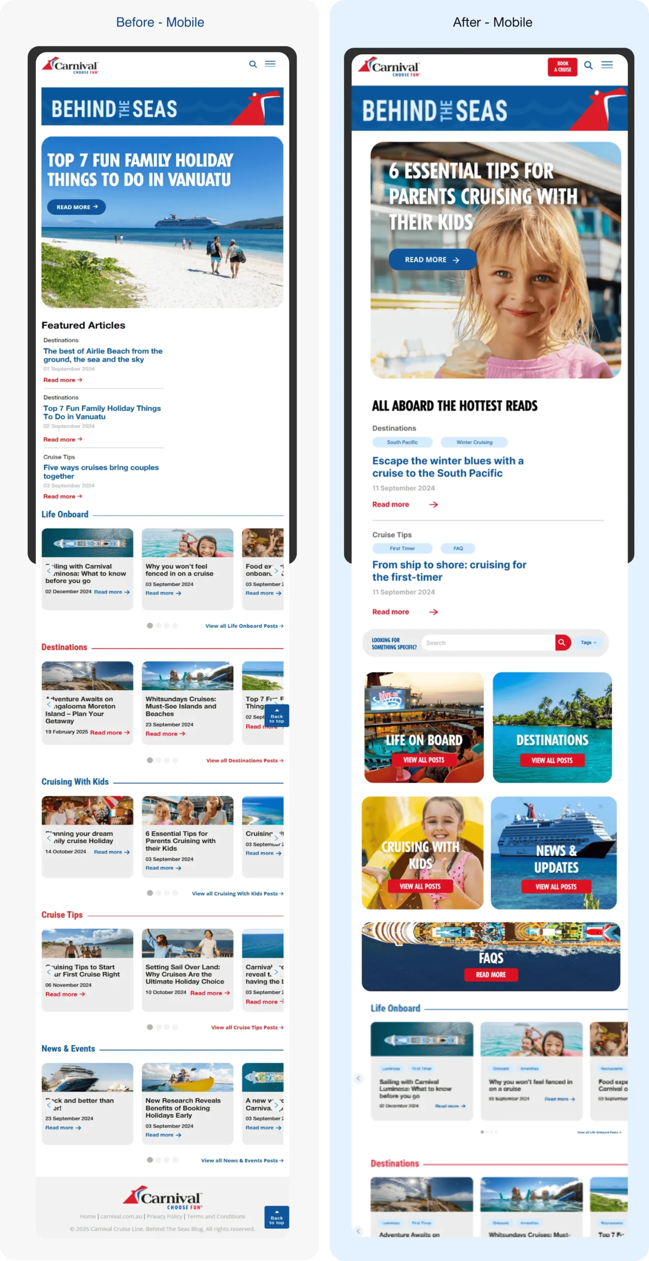
Redesigned the mobile blog homepage to improve scroll flow, content visibility, and tap-friendly navigation.
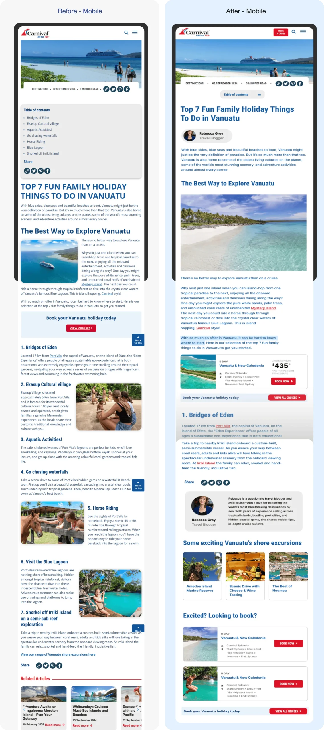
Redesigned the mobile blog destination page to improve readability, add visual storytelling, and streamline booking pathways.
B. Blog Homepage (“Behind the Seas”) Redesign
The approach combined strategic research, stakeholder alignment, and modular design to address UX gaps while leveraging WordPress and Optimizely frameworks. After defining high‐level principles, the Blog Homepage (“Behind the Seas”) was overhauled through a series of targeted interventions:
Intervention 1.0
Imagery Resizing & Placement
Small, inline images cluttered the content flow, so full‐width, high‐resolution visuals were introduced to span the content column and draw readers in.
Stage 1 implemented full‐row images in place of low‐res placeholders. Stage 2 will automate featured imagery via a dynamic media library, ensuring new posts follow the same full‐width format.

Improved the header for stronger brand presence on the blog homepage.

Refined the hero section of the blog post with a larger image for a more engaging first impression.
Intervention 2.0
Typography & CSS Alignment
Inconsistent fonts and styling undermined brand cohesion, so headings were standardized to Tempo and body copy to Open Sans to match CCL’s main site.
Stage 1 updated CSS rules in the WordPress theme to enforce these font choices. Stage 2 will refine responsive type scales—adjusting heading sizes at each breakpoint for optimal legibility.
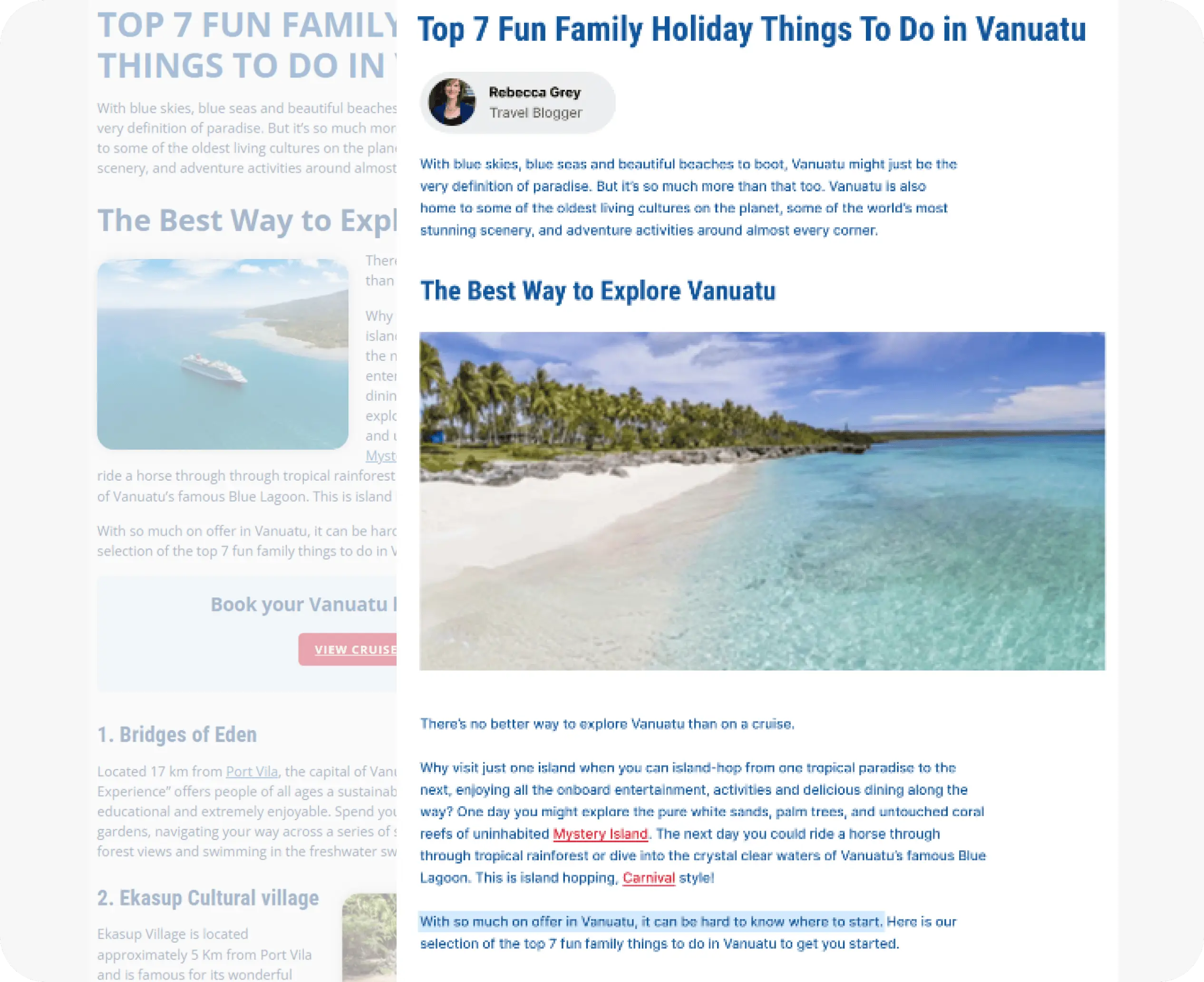
Improved typographic hierarchy and CSS alignment to bring the blog’s visual language in line with CCL’s brand standards.
Intervention 3.0
Top Navigation Bar Integration
Users lacked an obvious way back to the main site, so a prominent “Book Your Cruise” button was added to the blog navbar.
Stage 1 inserted the new button linking to the CCL homepage (with A/B tests planned for “Book a Cruise” vs. “Return to CCL Homepage” text). Stage 2 will introduce a sticky navbar variant that remains visible during scroll, ensuring the call-to-action is always accessible.

Integrated a clear “Book a Cruise” CTA into the blog’s top nav to improve cross-site flow and keep conversions within reach.
Intervention 4.0
Blog Tagging System
Broad categories made it hard to find specific content, so a granular tag set (e.g., “South Pacific,” “Mediterranean,” “Shore Excursions,” “Loyalty Tips”) was defined and applied.
Stage 1 enabled WordPress’s built-in tagging, retroactively tagging 50+ legacy posts. Stage 2 will integrate tag-based filtering into search, adding an autocomplete dropdown that suggests tags as users type.
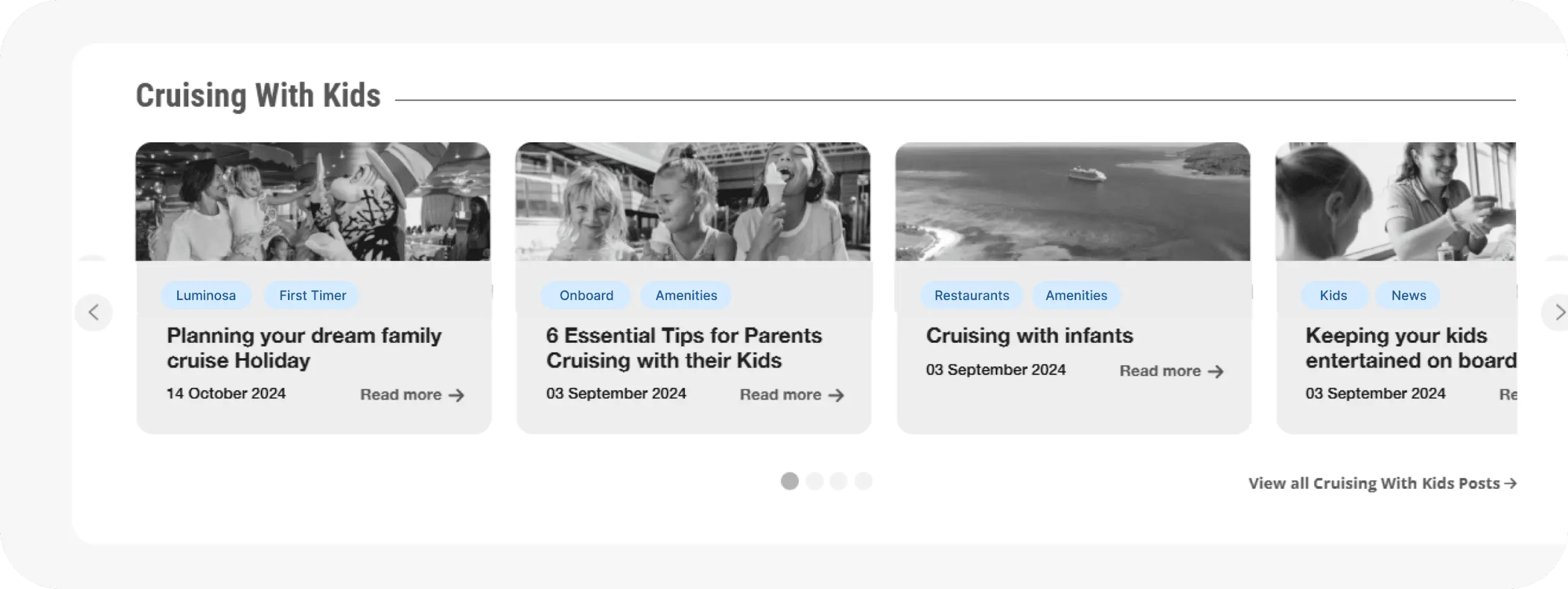
Introduced a detailed tagging system to improve content discoverability and support future filter-based search enhancements.
Intervention 5.0
Related FAQs Module
Readers had to leave posts to find answers, so a WordPress FAQ plugin was integrated, and 3–5 relevant FAQs were manually added to each blog post.
Stage 1 installed the plugin and populated FAQs (e.g., “What to pack for Vanuatu?”). Stage 2 will explore tag-based “popular FAQs” auto-population, pulling frequently viewed items into each post dynamically.
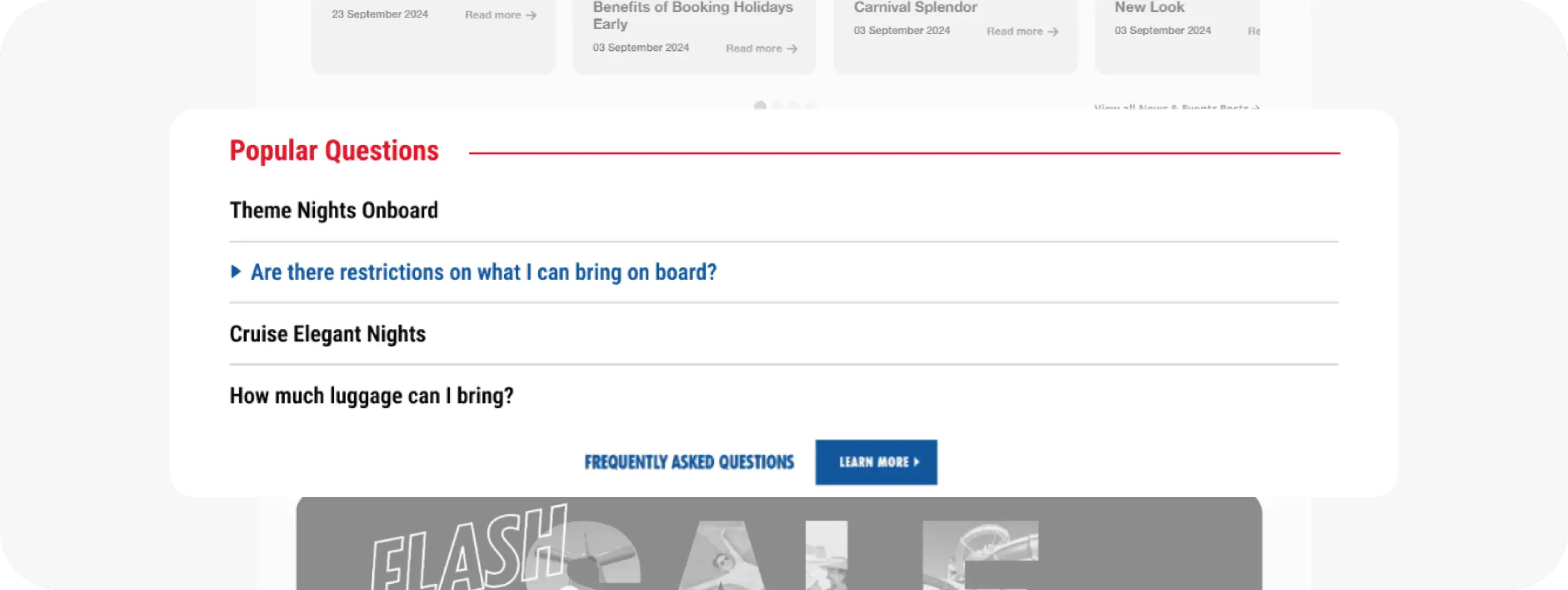
Added an in-article FAQ module to reduce drop-offs and surface answers without disrupting the reading experience.
Intervention 6.0
Search Bar & Tag-Based Search
The small, buried search input hindered content discovery, so the form was redesigned with a larger field, placeholder text (“Search Behind the Seas…”), and a dropdown for recent tags.
Stage 1 implemented the enlarged search bar with a basic recent-tag hint. Stage 2 will enable true tag-based filtering—autocomplete suggestions matching predefined tags as the user types.

Collapsed Search View (Default State)

Expanded Search View (Tag-Based Search Open)
Intervention 7.0
Blog-Type Navigation Grid
No quick way existed to browse by theme, so a responsive category grid was planned (“Destinations,” “Cruise Tips,” “VIFP Club Stories,” “Shore Excursions”) with card‐style visuals linking to filtered tag archives.
Stage 1 scoped wireframes for the grid layout. Stage 2 will build and test the grid on desktop and mobile.
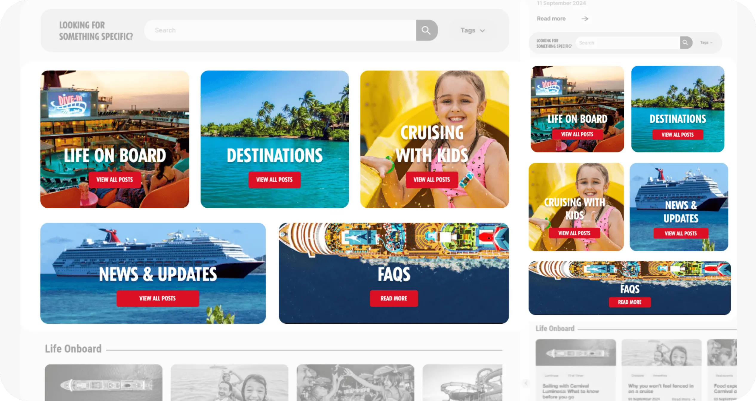
Introduced a visual category grid to help users browse by theme—making it easier to explore content like Destinations, FAQs, and Cruise Tips - Desktop view on left and mobile view on the right.
Intervention 8.0
Sign-Up & Latest Deal Banners
Organic blog traffic wasn’t converting because there were no conversion prompts, so Optimizely banners from the main site were reused: “Sign Up for Our Deals” and “Latest Deals.”
Stage 1 dropped in the “Sign Me Up” CTA banner and a dynamic “Latest Deals” module below the search bar using WordPress shortcodes. Stage 2 will A/B test alternate formats (e.g., “Get Deals Now”) and refine banner placement based on click data.


Added Optimizely-powered banners for “Sign Up” and “Latest Deals” to convert blog readers into active cruise prospects.
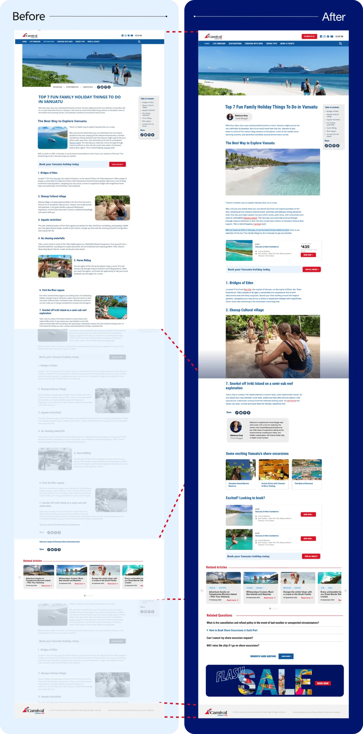
Redesigned the desktop blog destination page to enhance layout clarity, support richer content modules, and drive stronger cruise bookings.
C. Cruise Destinations Page Enhancements
A similar structured approach was applied to the Cruise Destinations page enhancements:
Intervention 9.0
Backlinking
The article had no SEO-friendly crosslinks, so internal anchors to “Cruise Deals,” “Shore Excursions,” and “VIFP Club Benefits” were embedded throughout.
Stage 1 manually added styled <a> tags to key phrases. Stage 2 will automate link suggestions via a plugin that scans for relevant keywords.

Embedded internal links to boost SEO and guide users toward high-value pages like Cruise Deals and Shore Excursions.
Intervention 10.0
Author Attribution
Posts lacked bylines, reducing credibility, so author names (“By Jane Doe, CCL Writer”) were added beneath each title.
Stage 1 updated the template to display a static author field. Stage 2 will introduce “Contributor Profiles” for agency writers, enabling a fallback author when internal staff aren’t available.

Designed a clear, consistent author byline layout to enhance scannability and establish visual hierarchy beneath post titles (right) and after the blog ends (left).
Intervention 11.0
Cruise Card Integration (w/ & w/o Pricing)
The page didn’t showcase specific cruises, so Optimizely-styled cruise cards were embedded for featured itineraries (e.g., “7-Day South Pacific Cruise—Starting at $1,199”).
Stage 1 manually dropped in static cruise cards with “Book Now” links. Stage 2 will sync dynamic pricing via API from Sitecore so cards auto-update as rates change.
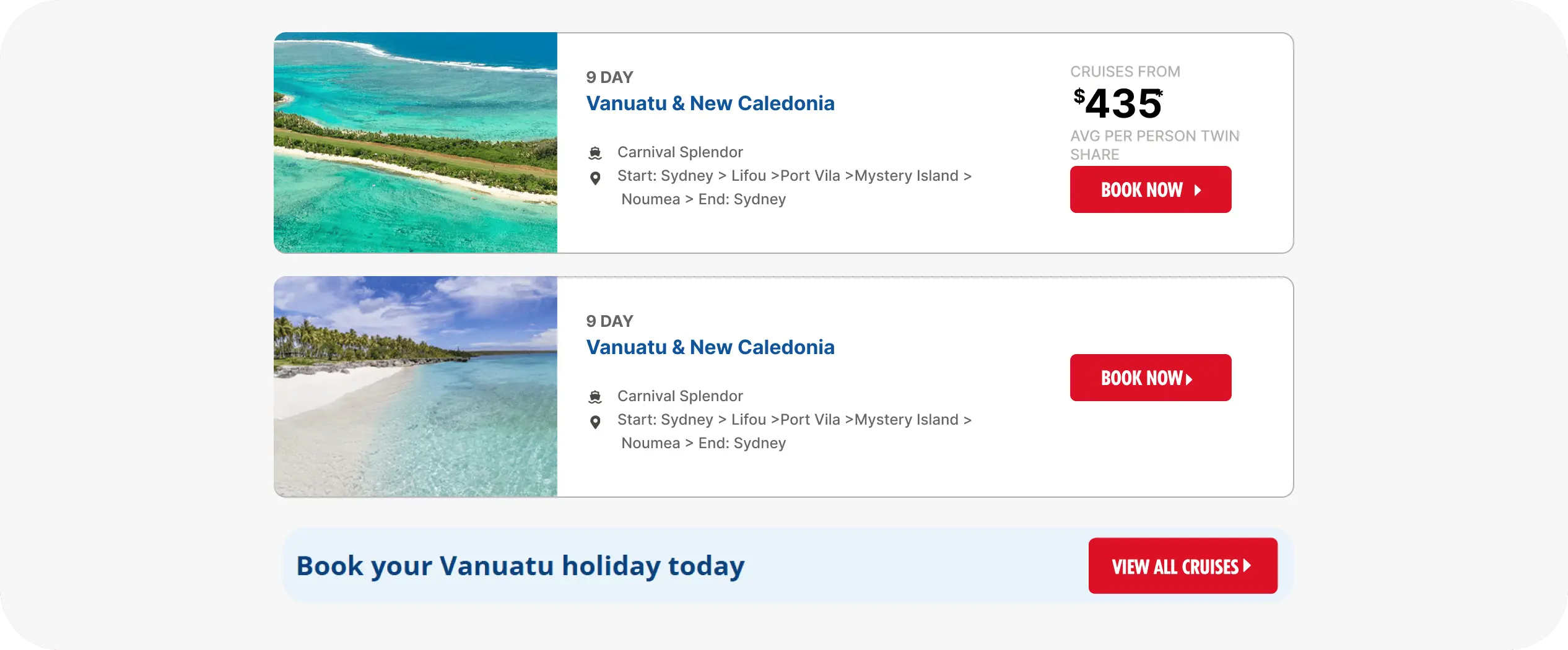
Embedded cruise cards with itinerary details and bold CTAs to bring booking opportunities directly into destination content.
Intervention 12.0
Shore Excursions Linkage
No excursions were highlighted, so a “Shore Excursions” section was designed with three clickable cards.
Stage 1 created wireframes for the section. Stage 2 will build and populate these cards, linking to individual excursion detail pages.

Designed a dedicated section to showcase shore excursions with clickable cards—adding depth and visual variety to destination pages.
Implementation & Testing Strategy
Each enhancement involved rigorous phased implementation, supported by comprehensive A/B testing, analytics reviews, and continuous monitoring. Specific dependencies included coordination with the Miami development team for technical integrations, alongside local analytics setups to precisely track user interactions and conversions.
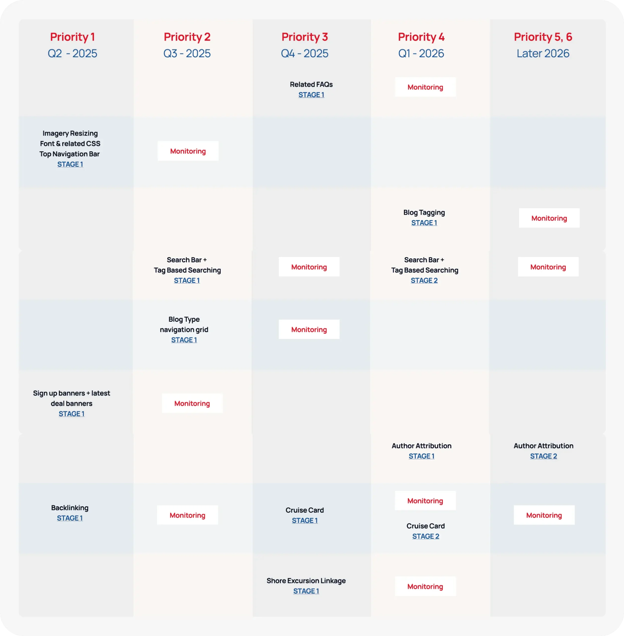
Phased implementation and testing roadmap: Outlining staged rollouts, monitoring milestones, and key dependencies to ensure successful execution and optimisation.
Anticipated Outcomes
- Improved Brand Cohesion: Seamless typography and consistent imagery align the blog with CCL’s main site, reinforcing trust and professionalism.
- Enhanced Content Discoverability: Tag-based navigation and a redesigned search bar enable readers to quickly find “South Pacific” or “Mediterranean” posts, reducing bounce rates.
- Higher Conversion Potential: Prominent “Sign Up for Deals” and “Latest Deal” banners capture lead information; embedded cruise cards drive direct traffic to booking pages.
- Increased Engagement: Related FAQs and shore-excursion highlights keep readers on page longer; visually rich images and cruise cards encourage exploration.
- Stronger SEO & Navigation: Internal backlinks improve search engine rankings and guide users back to CCL’s core site.
- Scalable, Modular Architecture: Optimizely-driven banners and WordPress shortcodes ensure future deal updates are centralized—boosting efficiency in ongoing optimizations.
Next Steps
- Continue ongoing data-driven optimisations based on user interaction insights.
- Expand personalisation efforts through enhanced data integration and targeted user segmentation.
- Further refine modules with regular analytics reviews and iterative improvements.
Other projects


