! This project is a part of a series ! UX Revamp has been undertaken for the following pages:
01 Homepage | 02 Blog & Cruise Destinations | 03 Cruise Deals (You're viewing this currently)
CCL Australia's Deals Page
UX Re-evaluation & Re-design
Role
UX Designer working with CCL's Marketing team
Duration
1 month
Tools
Figma, Adobe Creative Suite, Collaboration Tools (e.g., Miro, Asana)
Teams Involved
CCL Marketing Team: Primary stakeholders who own the marketing strategies and the website
P&O's UX Designer - AdHoc: Collaborating on the Website UX improvement of high traffic areas

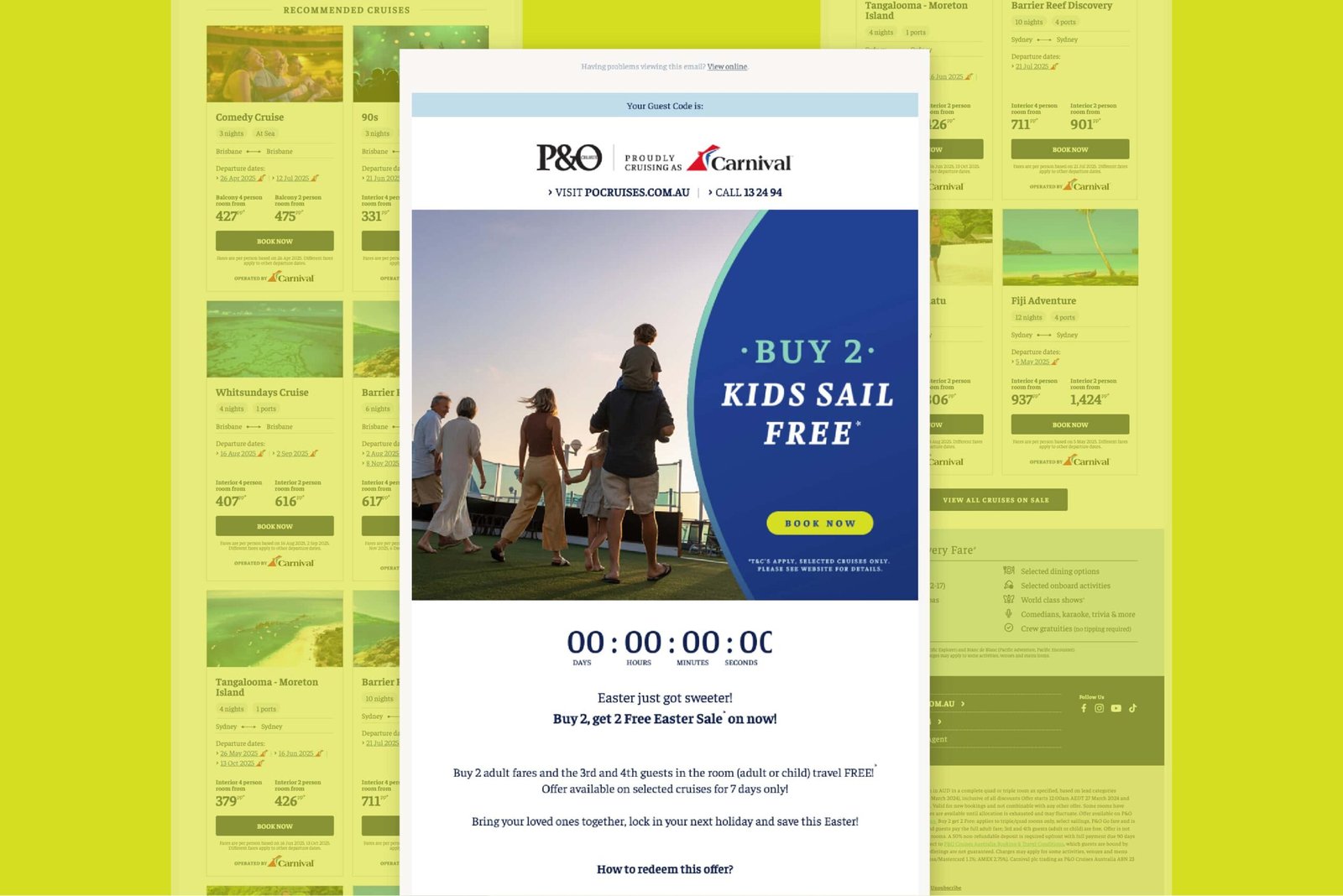
Proposed Deals Page – Shows the redesigned header with prominent “Show My Deals” and “Login” CTAs, scrollable image-rich deal cards featuring primary offers and urgency banners, and the “Fun From Coast to Coast” destination module at the bottom.
Problem Overview
Carnival Cruise Line Australia’s deals page felt dated—its dense text and banner-heavy layout made scanning offers difficult, and without interactive highlights, filters or urgency cues, many visitors abandoned before booking.
Solution
I converted dense text into bite-sized deal capsules with icons and introduced image-rich cruise cards with urgency cues. I also repurposed high-performing homepage modules and added intuitive filters.
My Role
As the UX Designer, I conducted competitive research and stakeholder workshops. I partnered with CCL’s marketing team to assess resource constraints and external development needs, balancing what could be built in Optimizely versus what needed Sitecore integration.
Deliverables
In the Cruise Deals documentation PDF, I delivered a UX process overview with key resource links—including Miro boards, Figma files, and shareable PDFs ; Stage 1 & 2 of all the designs changes suggested with their detailed implementation plan. The document also has a prioritized rollout timeline and a comprehensive A/B testing and monitoring framework—covering heatmaps, scroll-depth tracking, click analysis, and user surveys—to validate performance and drive ongoing optimisation.

Documentation of refreshed cruise deals layouts, experimental modules, and a detailed A/B testing plan to guide optimisation and measure impact.
Challenges & Opportunities
Our research uncovered several critical challenges:
Content overload and weak visual hierarchy made it difficult for users to quickly discover and compare deals.
Low visibility of top offers in the hero panel caused users to drop off before engaging with the page.
The absence of urgency cues like countdown timers and consistent deal context throughout the booking process left users unmotivated to proceed.

Competitor Analysis Overview – Displays a grid of audited cruise and travel brands (including Norwegian, Costa, Carnival, Virgin Voyages, Mein Schiff, Celebrity Cruises, Booking.com, Royal Caribbean, Airbnb, and Disney Cruise Line) alongside a snapshot of the annotated research board, summarizing key takeaways and visual patterns from each site.
Competitor Analysis
Comprehensive analysis of leading competitors (e.g., Virgin Voyages, Royal Caribbean, Norwegian Cruise Line, Booking.com, Disney Cruise Line) provided strategic insights:
- Large hero banners spotlighting the current top offer with a clear “Book Now” CTA
Deals organized into intuitive categories (destination, price range, last-minute specials) - Cross-sell modules promoting onboard-credit and loyalty program benefits
- Quick filters and search bars allowing users to refine by region, date or price
- Urgency cues such as countdown timers and limited-time banners
- Prominent email-signup CTAs positioned near deal listings

Before & After Deals Page – Before: outdated layout with static text and buried CTAs. After: modern header, scrollable image-rich cards with urgency banners, the “Fun From Coast to Coast” module, and updated footer.

Mobile Before & After – The old mobile view had a static VIFP Club banner with a buried “Show My Deals” CTA and text-heavy listings; the new version features a personalized VIFP Club banner with clear “Show My Deals” and “Login” buttons, followed by scrollable, image-rich deal cards with prominent pricing and urgency cues.
Intervention 1.0
Header Visual Redesign
The existing header looked dated and lacked clear visual hierarchy, brand consistency, and prominence of primary CTAs, which undermined engagement and conversions.
In Stage 1, I modernized the VIFP Club banner, restructured the hero hierarchy for better readability, and made the “Show My Deals” and “Login” buttons visually prominent across all devices. In Stage 2, I proposed dynamically personalising that hero content by user segment and loyalty status—working with back-end and marketing IT teams to deliver targeted messaging.

Logged Out vs Logged In Header of the proposed design – Top shows the unauthenticated state with a loyalty number input and “Show My Deals”/“Log In” buttons; bottom displays the authenticated view greeting the member by name, showing their VIFP Club number and tier.
Intervention 2.0
Deal Information Redesign
This redesign reimagines how cruise-deal details are presented. The previous layout relied on large blocks of text, making it difficult for users to scan and compare offers.
The new design introduces icon-driven capsules paired with concise benefit statements, surfacing the main selling point alongside the deal name for immediate comprehension. In Stage 1, capsule-style modules were implemented with relevant icons and short snippets to break up text and highlight key benefits at a glance. In Stage 2, interactive tooltips and live pricing filters were proposed, enabling users to refine and compare offers without leaving the module.

Before & After Deal Header – Top shows the old deal row with a simple image, text details, and price/“Book Now” button; bottom displays the new header bar with icon-driven badges for “Up To $50 On Board Credit” and “Reduced Deposits,” plus a “Book by 19 March 2025” countdown element.

Proposed Deal Information – Highlights the new deal information design in the design along with the cruise deal content as discussed in the next section.
Intervention 3.0
Deal Cruise Cards & Primary Offer
This redesign transforms plain text listings into scrollable, image-rich cruise cards that spotlight a primary offer with prominent pricing and supporting imagery.
Urgency banners for limited-time offers, onboard-credit callouts, and countdown timers were layered in to encourage users to take action quickly. In Stage 1, the card-based layout was implemented with clear hierarchy—separating price, inclusions, and departure dates, and placing CTAs prominently alongside rich visuals. In Stage 2, real-time countdown overlays and “last-seen price” badges were proposed to heighten urgency and transparency, requiring additional front-end collaboration.

Proposed Deal Cards Placement – Highlights the new scrollable, image-rich cruise cards section within the full deals page context, Features a bold “Flash Sale | Reduced Deposits at $50pp” header with icon-driven badges and a live countdown timer at the top

Sample Deal Modules – Shows “Choice Plus | Reduced Deposits at $50pp” and “Fun Select | Reduced Deposits at $50pp” deal sections, each featuring the icon badges, countdown timer, primary offer card (e.g., “Starting $579”), and scrollable itinerary cards with clear “Shop Now” CTAs.
Intervention 4.0
Add-On Modules
This redesign repurposed UI components from high-performing pages—leveraging familiar elements to maintain brand consistency, reduce development time, and enrich the deals page experience.
In Stage 1, existing modules such as the Fun From Coast to Coast carousel and cross-sell panels were integrated and adapted for content consistency and mobile optimization. In Stage 2, contextual FAQ modules and personalized cross-sell recommendations driven by user behavior were proposed to further boost engagement and time on page.

Fun From Coast to Coast Module – This carousel is repurposed directly from the highly functional UI components designed for the homepage and seamlessly integrated into the deals page.


Log in & Sign up banners - Components repurposed directly from the highly functional UI components designed for the homepage and seamlessly integrated into the deals page.
Implementation & Testing Strategy
Each enhancement involved rigorous phased implementation, supported by comprehensive A/B testing, analytics reviews, and continuous monitoring. Specific dependencies included coordination with the Miami development team for technical integrations, alongside local analytics setups to precisely track user interactions and conversions.

Phased implementation and testing roadmap: Outlining staged rollouts, monitoring milestones, and key dependencies to ensure successful execution and optimisation.
Anticipated Outcomes
Anticipated outcomes include higher engagement with the “Show My Deals” and “Login” CTAs as the refreshed header and cruise cards draw attention; faster deal discovery and lower abandonment rates thanks to bite-sized capsules and a clear visual hierarchy; increased booking conversions driven by urgency cues and prominent pricing; growth in VIFP Club sign-ups from a more compelling loyalty prompt; longer time on page as users explore rich modules and add-ons; an elevated brand perception through consistent, modern visuals; and more efficient iteration cycles enabled by modular Optimizely and Sitecore components.
Next Steps
- Continue ongoing data-driven optimisations based on user interaction insights.
- Expand personalisation efforts through enhanced data integration and targeted user segmentation.
- Further refine homepage modules with regular analytics reviews and iterative improvements.
Other projects