! This project is a part of a series ! UX Revamp has been undertaken for the following pages:
01 Homepage (You're viewing this currently) | 02 Blog & Cruise Destinations | 03 Cruise Deals
CCL Australia's Homepage
UX Re-evaluation & Re-design
Role
UX Designer working with CCL's Marketing team
Duration
3 months
Tools
Figma, Adobe Creative Suite, Collaboration Tools (e.g., Miro, Asana)
Teams Involved
CCL Marketing Team: Primary stakeholders who own the marketing strategies and the website
P&O's UX Designer - AdHoc: Collaborating on the Website UX improvement of high traffic areas

Suggested homepage redesign with dynamic content and personalised offers for Australian travellers.
Problem Overview
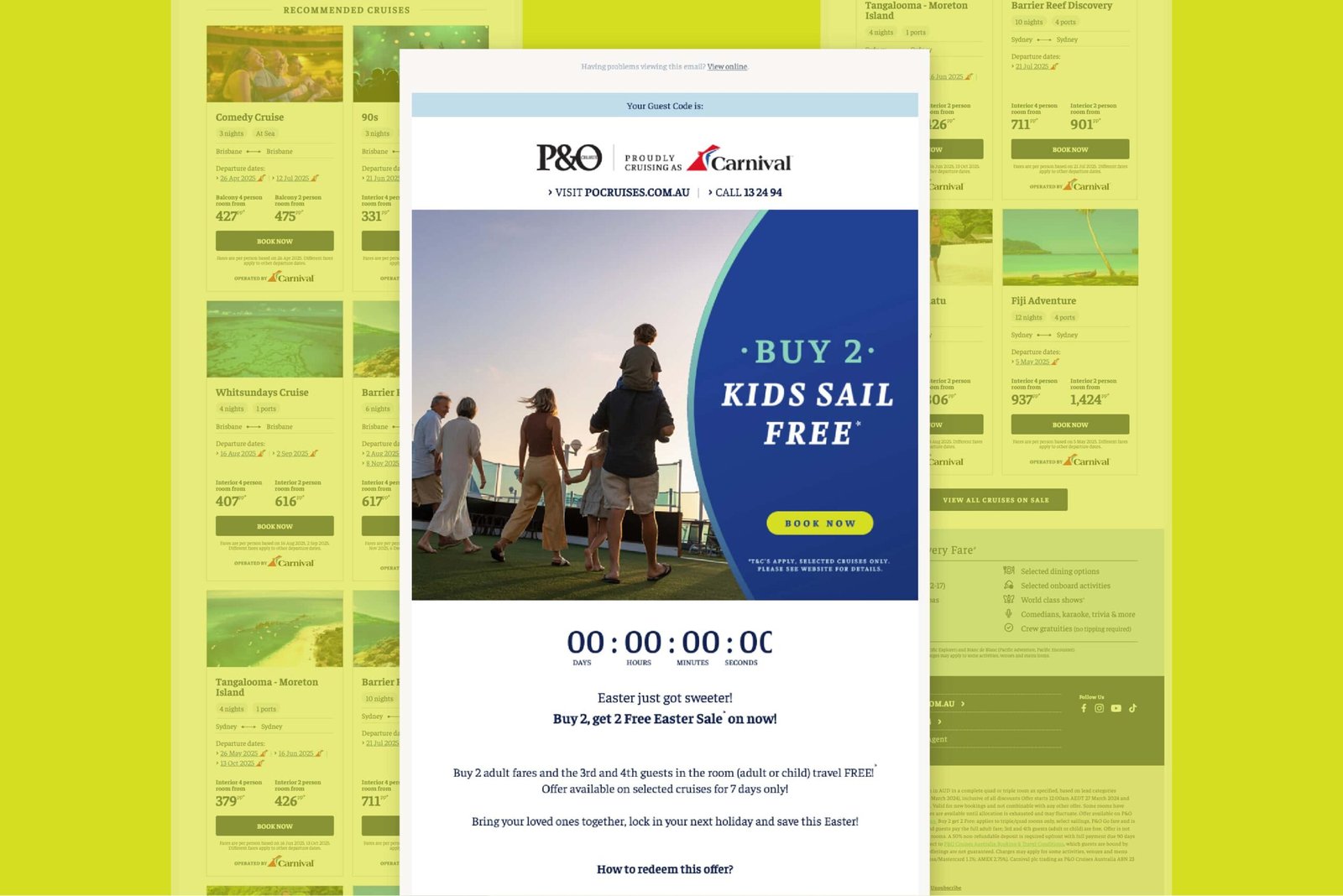
Carnival Cruise Line Australia's homepage was based on the US site, resulting in static content that didn't resonate with Aussie users. The lack of tailored, interactive content limited engagement and conversions.
Solution
I introduced dynamic, personalised features including interactive carousels, targeted cruise displays, personalised recommendations, integrated blog content, and clear sign-up banners, significantly improving user engagement.
My Role
As the UX Designer, I adapted and redesigned modules from the US Carnival site to suit CCL Australia's unique audience, ensuring alignment with our brand guidelines. I reviewed competitor approaches, assessed feasibility within our resource constraints, and crafted a tailored implementation strategy.
Deliverables
In the deliverable, a detailed documentation PDF, I outlined refreshed homepage layouts tailored to local user needs, proposed new experimental content modules, and developed a comprehensive implementation plan. I also detailed A/B testing methodologies to measure performance, validate results, and drive ongoing optimisation.

Documentation of refreshed homepage layouts, experimental modules, and a detailed A/B testing plan to guide optimisation and measure impact.
Challenges & Opportunities
Our research uncovered several critical challenges:
- Limited user interaction due to static homepage modules.
- Absence of personalised content and dynamic pricing tailored for local preferences.
- Valuable blog and informational content underutilized on the homepage.
- Insufficient mechanisms for capturing user leads and encouraging re-engagement.

Competitor landscape: Brands I researched and analysed to inform strategic design decisions

Visual documentation of competitor insights and strategic recommendations, captured in Miro to support the final presentation and design decisions.


Audience segmentation and HotJar behavioural insights mapped in Miro to uncover user needs, motivations, and key areas for homepage improvement.


Research and implementation tools: Leveraging Hotjar, Google Analytics 4, Tealium, and Optimizely to drive data-informed design and testing strategies.
Competitor Analysis
Comprehensive analysis of leading competitors (e.g., Royal Caribbean, Booking.com, Flight Centre, Intrepid Travel) provided strategic insights:
- Successful use of dynamic, personalized homepage modules significantly improved user engagement.
- Effective lead-capturing strategies through visible and persuasive sign-up banners.
- Integrating engaging, visually appealing blog content directly onto the homepage improved content discoverability and user retention.
- Personalized offers based on user browsing behavior significantly enhanced re-engagement and conversion rates.
Audience Insights
Detailed audience research (utilizing Hotjar, Tealium, GA4, Optimisely) identified clear user behaviors and preferences:
- High interest in shorter, affordable cruises departing from Brisbane and Sydney.
- Significant reliance on reassurances through user-generated content, blog posts, and detailed itinerary displays.
- Increased engagement with personalized, dynamic, and interactive content modules.
- Frequent repeat visits without immediate booking, highlighting the need for personalized re-engagement strategies.


Comparison of the US and Australia Carnival websites: Highlighting the growing UX and content gap caused by limited local enhancements on the Australian site.
Problem 1.1
The Need for a Local Experience
Originally, the Carnival Cruise Line Australia website was a localized adaptation of the Carnival US site. However, the Australian site stayed largely stagnant as the US team invested heavily in UX enhancements—growing their UX department, running A/B tests, personalizing content modules. With limited updates (only essential ones like the global top header), the AU website fell behind in both UX maturity and relevance for the local audience.
This created a significant UX and business gap:
- The Australian user base wasn't receiving tailored content.
- Key high-traffic pages didn’t reflect regional offers or booking behaviors.
- Legacy modules lacked features already proven effective in the US market.
To ensure Carnival Australia could compete, convert, and connect with its audience, we initiated a homepage revamp that aligned with our unique goals while taking cues from successful experiments conducted by our US counterparts.
Why a Homepage Revamp Was Critical
The homepage of any brand—especially in travel—is more than just a landing page. It’s a storytelling space, a navigational hub, and a conversion driver. For Carnival Cruise Line Australia, our homepage had become outdated, passive, and heavily reliant on a one-size-fits-all approach originally built for a US audience.
As the US site continued to evolve through iterative testing, UX-led enhancements, and modular optimization, the Australian site remained static—missing opportunities to speak directly to our market and maximize user engagement.

Full preview of the redesigned homepage: Addressing key UX gaps with dynamic carousels, personalised itinerary modules, blog content integration, enhanced sign-up banners, and tailored browsing reminders—ready for implementation and testing.
Setting the Foundation for Change
We kicked off the homepage redesign by tackling six key opportunity areas:
- Updated Displays on Carousels – Making banners more interactive and varied (deals, blogs, loyalty perks).
- “Fun From Coast to Coast” Module – Adapting a dynamic itinerary feature from the US site for AU-specific destinations.
- Targeted Itinerary Tiles – Highlighting short breaks and ship-specific offerings to appeal to local travelers.
- Blog Component – Introducing content tiles to surface helpful, SEO-friendly travel guides and tips.
- Sign-Up Banners – Capturing more email leads through visually prominent and personalized modules.
- Browser History Itinerary Reminders – Personalizing return visits by showing users their previously browsed cruises.
Each component was mapped out with a staged strategy (manual to automated), A/B testing plans, dependencies (especially with the Miami office for some dev rollouts), and a clear focus on improving user engagement, discoverability, and conversions.

Existing carousel showcasing promotional deals—retained in the redesigned homepage with additional new content types introduced to create a more dynamic, scrollable experience.
Intervention 1.0
Interactive Carousel Displays
The existing carousel featured auto-rotating banners that displayed only ongoing deals, with no user interaction.
To improve engagement and discoverability, Stage 1 introduced three content types: current sales, the most visited blog, and a VIFP (loyalty program) promotion. These additions helped surface non-deal content while tracking user interaction for future optimisation. In Stage 2, we proposed implementing a fully controllable carousel—giving users the ability to manually scroll through banners. This stage required collaboration with the Miami office for development. Through this, we enabled better testing flexibility and gave users more control, enhancing satisfaction and engagement.

New carousel addition: Highlighting blog content to promote helpful travel insights and boost user engagement beyond deals.

Additional carousel tile linking to ship details and informational pages, helping users explore features and plan their experience more easily.

Suggested Stage 2 enhancement: Adding manual navigation and position indicators to the carousel for improved user control and orientation.
Intervention 2.0
New Destination Specific Module - Fun From Coast to Coast
Adapted from a Carnival US original, this module showcases CCL Cruise Lines Australia's key destinations: New Zealand, Asia, and the South Pacific, departing from Sydney and Brisbane.
In Stage 1, it combined short breaks with major destinations like the Pacific Islands and New Zealand. This helped us test the value of dynamic pricing tiles and identify which offers Australian users interacted with most. In Stage 2, short breaks were moved to a dedicated section, allowing this module to focus solely on extended itineraries. The use of algorithm-driven content brought relevance and flexibility, with ongoing A/B testing to compare destination performance and content engagement.

Stage 1 of the "Fun From Coast to Coast" module: Combining short breaks and key destinations to test dynamic pricing tiles and user engagement for CCL Cruise Lines Australia.

Stage 2 refinement of the "Fun From Coast to Coast" module: Focused solely on extended itineraries, with short breaks separated to enhance destination relevance and user targeting.
Intervention 3.0
Varied Target Itineraries with Pricing
This module aimed to surface short break cruises and ship-specific itineraries (like Carnival Splendor and Luminosa), identified as high-interest via Hotjar and other user data.
Stage 1 focused on creating tiles tailored by cruise length and ship. In Stage 2, we plan to integrate blog content into these tiles, offering users additional context and inspiration—building an experience around the cruises, not just the pricing. Testing strategies involve comparing modules with and without pricing, measuring click-through rates and bookings to see which formats resonated most.

Stage 1 of the "Short Breaks" module: Introducing tailored itinerary tiles highlighting short cruise options and ship-specific getaways to better meet local traveller preferences.

Stage 2 enhancement: Showcasing ship-specific itineraries alongside relevant blog content to create a richer, more informative cruise browsing experience.
Intervention 4.0
Blog Component
Unlike the US site, the Australian homepage lacked blog integration—despite having rich content on WordPress.
Stage 1 involves manually curating and featuring up to three blog posts directly on the homepage. We will test different layouts, CTAs, and topics to determine what drove the most interaction. Stage 2 proposes an automated blog feed using a WordPress integration to keep content fresh with minimal manual effort. The goal is to establish the blog as both a conversion support tool and a retention channel, enhancing SEO and keeping users engaged longer.


New blog component added to the homepage: Featuring curated articles to boost engagement, support conversions, improve SEO, and keep users exploring longer.
Intervention 5.0
Sign-Up Banners
To increase lead generation, we will implement a staged rollout of sign-up banners.
Stage 1 will introduce a prominent banner at the top of the homepage for all users. Stage 2 will include versions tailored to logged-out and logged-in users, each with different messaging strategies. A/B testing variations will include incentives, CTA language, and visual treatments. These changes will aim to improve newsletter subscriptions and loyalty club enrolment, providing Carnival AU with more opportunities for targeted marketing.


New sign-up banners designed to boost lead generation and loyalty program enrolments through targeted messaging and incentive-driven calls-to-action.
Intervention 6.0
Browser History Itinerary Module
To increase lead generation, we will implement a staged rollout of sign-up banners.
This module will be designed to re-engage returning users by displaying cruises they have previously browsed but not booked. Visible only when relevant data is available (via cookies or login), the module will create a “pick up where you left off” experience.
We will test display logic based on recency (1 vs 2 weeks), personalised CTAs, and differences in behaviour between logged-in and anonymous users. The result will be a more seamless, user-focused journey that increases return visits and bookings.

Suggested "Still Looking to Cruise?" module: Designed to re-engage users by surfacing previously browsed itineraries, encouraging return visits and higher booking conversions.
Implementation & Testing Strategy
Each enhancement involved rigorous phased implementation, supported by comprehensive A/B testing, analytics reviews, and continuous monitoring. Specific dependencies included coordination with the Miami development team for technical integrations, alongside local analytics setups to precisely track user interactions and conversions.

Phased implementation and testing roadmap: Outlining staged rollouts, monitoring milestones, and key dependencies to ensure successful execution and optimisation.
Anticipated Outcomes
These strategic enhancements were expected to significantly increase user engagement, improve lead-generation capabilities, boost re-engagement of returning visitors, and elevate overall user satisfaction. The final objective was to deliver a highly relevant, dynamic, and personalised homepage tailored to the unique needs of Carnival Cruise Line Australia's customer base.
Next Steps
- Continue ongoing data-driven optimisations based on user interaction insights.
- Expand personalisation efforts through enhanced data integration and targeted user segmentation.
- Further refine homepage modules with regular analytics reviews and iterative improvements.
Other projects